In developer lingo, quality-of-life updates are all about refining things that already work. Thanks to these incremental improvements, it should make the end user experience much more enjoyable. And with iOS 13, it feels like Apple’s main focus is on this concept.
Dark Mode is basically the only new flashy feature of iOS this year. But that’s not a bad thing. From my experience, all the tiny refinements across the board are really convincing. iOS 13 is a much more interesting release than iOS 12 for instance.
I’ve been playing with early beta versions of iOS 13, so here’s what you should be looking for.
Dark Mode is gorgeous
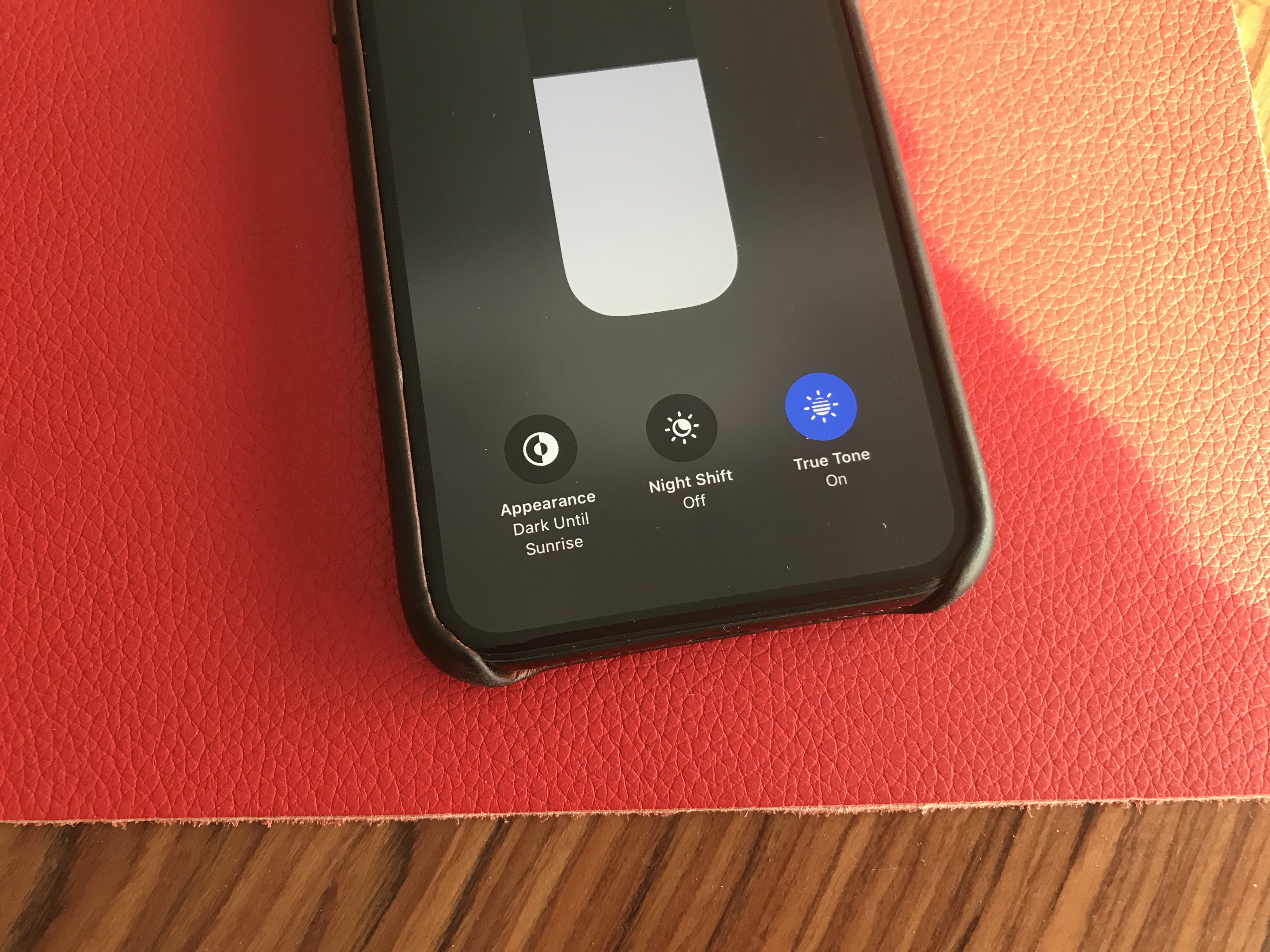
Dark Mode is here, and it looks great. It’s a system-wide trigger that completely transforms the look and feel of your iPhone — you have to play with it to really feel the difference. The easiest way to activate it is by opening the Control Center panel, long pressing on the brightness indicator and turning it on.
While you can trigger it manually, you can also select an automated mode in the settings. Right now, my phone becomes dark at night and lights up in the morning. iOS uses your current location to time the change with the sunset and sunrise.
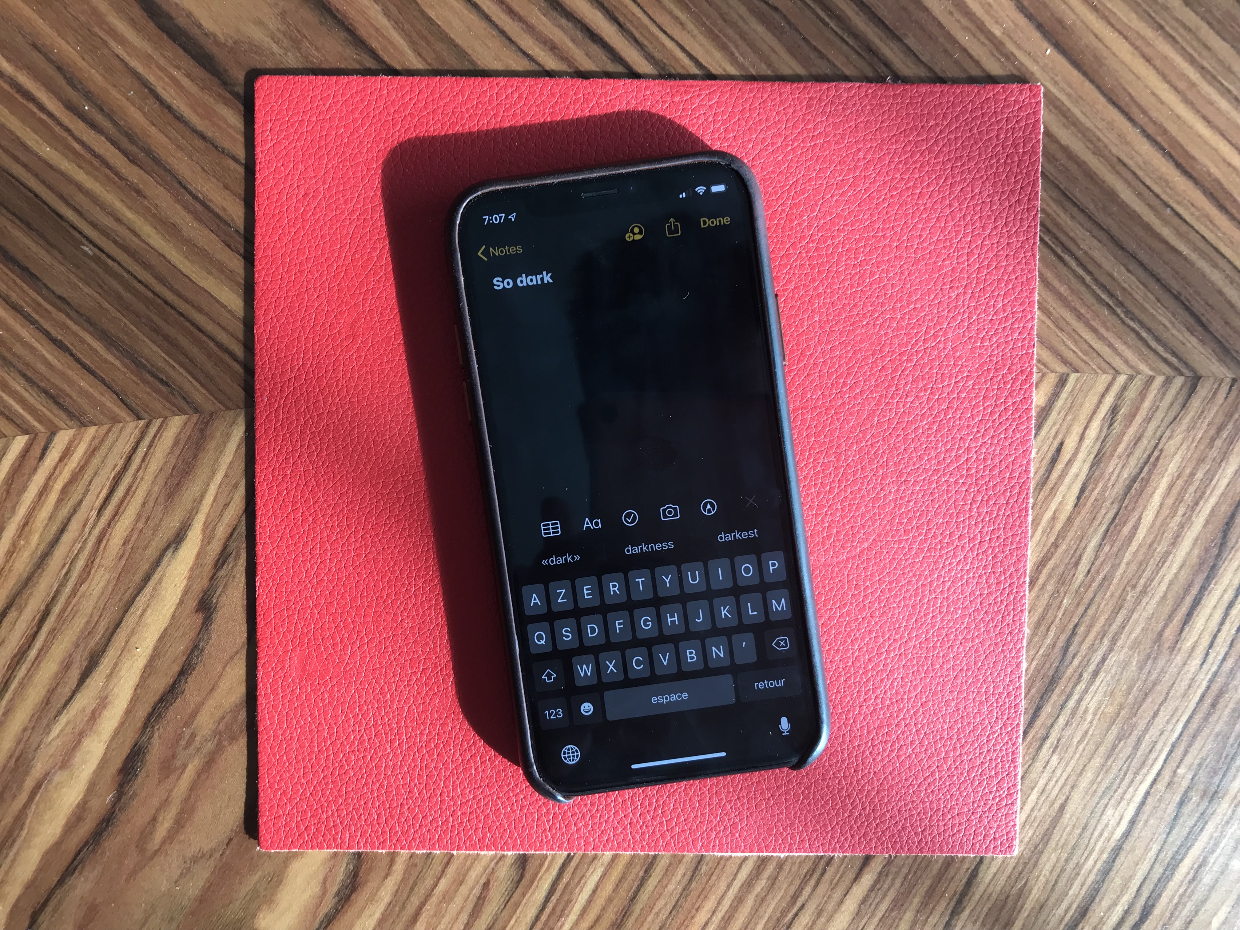
Widgets, notifications and menus now use black or transparent black as much as possible. You can choose new Apple wallpapers that change when you turn on Dark Mode, or you can optionally dim your custom wallpapers at night.
Apple has updated all its apps to support Dark Mode, from Notes to Mail, Messages, Safari and more. And it works really well with those apps.
But the issue is that many third-party apps haven’t been updated for Dark Mode yet. So it’s a disappointing experience for now, but I’m sure many app developers will update their apps before the final release of iOS 13.
Many apps already support have a dark version that you can trigger in the app settings. But Apple really wants third-party developers to follow the system-wide option going forward. So those apps will have to be updated as well.
Low-level improvements
iOS still looks like iOS. But if you carefully pay attention to your first experience of iOS 13, you’ll notice two things. First, animations have been sped up — it feels like unlocking your phone, opening and closing an app or swiping on a notification are much faster. It’s hard to know if those actions have been optimized or if it’s just Apple hitting the fast-forward button.
Second, Face ID is better. It’s not a dramatic change, but your phone recognizes you a tiny bit faster than before. iPhone users will appreciate that they don’t have to buy a new phone for this free improvement.
The two other iOS 13 changes that you can experience in any app is that the keyboard now supports swipe-to-type and the share sheet has been updated. It is now separated in three areas: a top row with suggested contacts to send photos, links and more depending on your most important contacts.
Under that row of contacts, you get the usual row of app icons to open something in another app. If you scroll down, you access a long list of actions that vary from app to another.
Siri and the Shortcuts app have been improved and now work more closely together. In addition to a more natural Siri voice, Shortcuts is now installed by default with iOS, which is great news for automation and scripting on your phone.
And I was surprised to see all my voice-activated Siri Shortcuts in the Shortcuts widget. For instance, since iOS 12, I’ve been able to say “Hey Siri, I’m heading home with Citymapper” to launch Citymapper with directions to my home. There’s now a button in the Shortcuts app to trigger that Siri Shortcut.
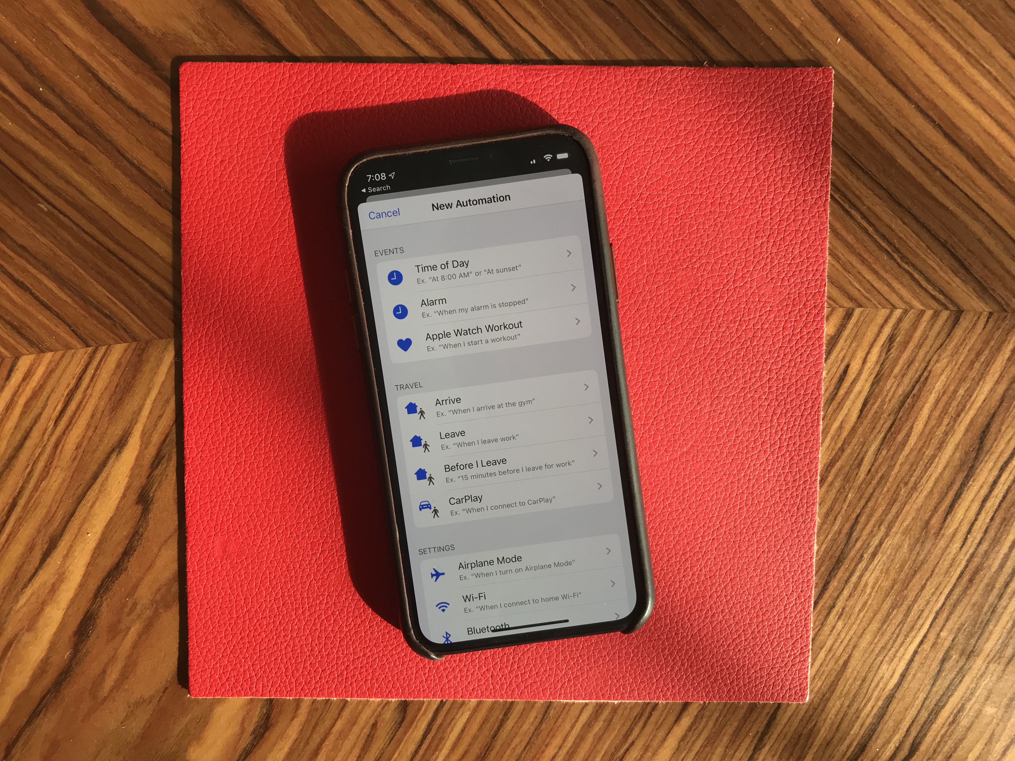
More interestingly, you can now create automated triggers to launch a shortcut. For instance, you can create scenarios related to CarPlay, a location or even a cheap NFC tag. Here are some examples:
- Launch a music playlist when I connect my phone to CarPlay or to my car using Bluetooth.
- Dim my screen and turn on low power mode when I activate airplane mode.
- Turn off my Philips Hue lights when I put my phone on an NFC sticker on my nightstand.
App improvements
All first-party apps have been improved in one way to another. Some changes are small, but a few apps have received a massive update.
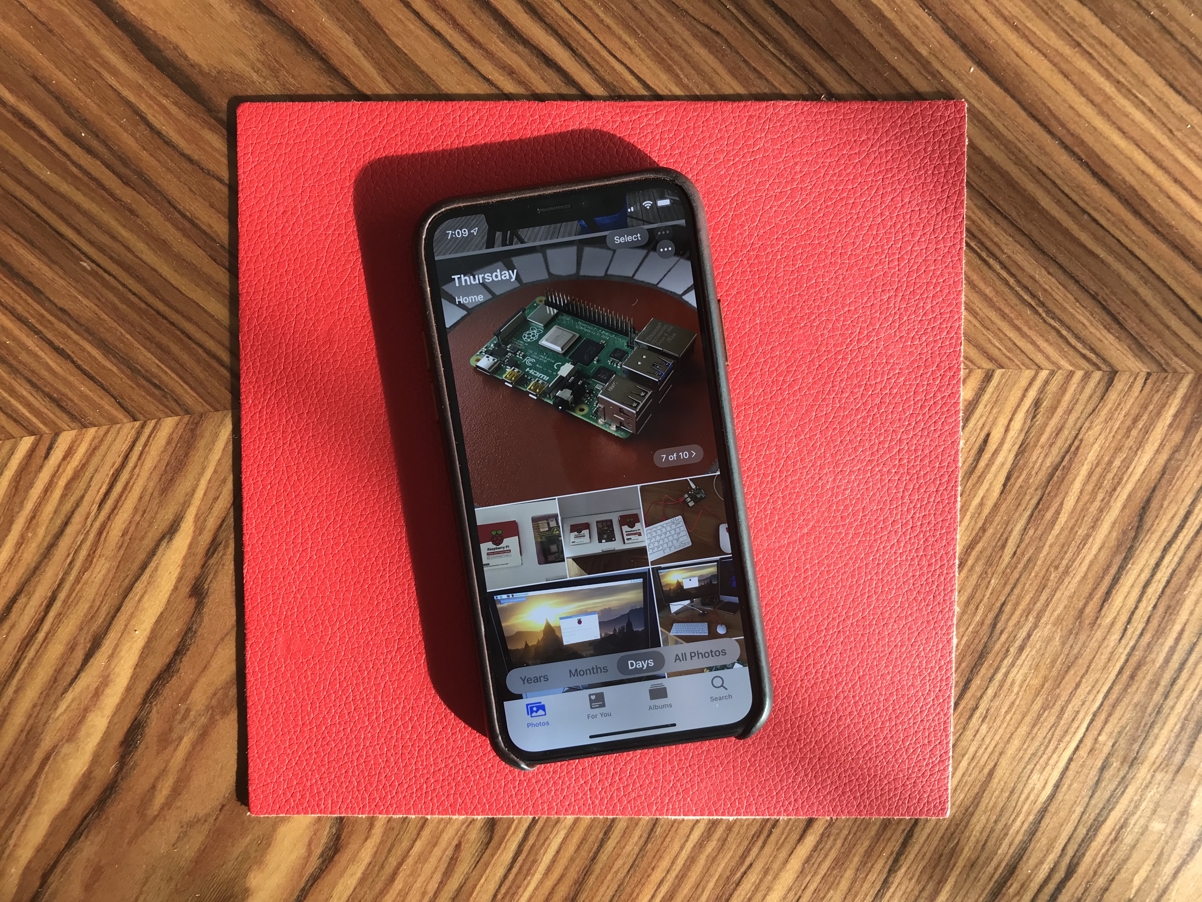
Photos looks completely different with a new main tab. Instead of relatively boring looking grid of photos, you now get four sub-tabs that should help you navigate your photo library more efficiently.
‘Years’ lets you jump straight to a specific year. The ‘Months’ view is the most interesting one as iOS tries to sort your photos in smart albums based on dates and locations. When you open an event, you get the best photos of this event in the ‘Days’ tab. Some photos, such as duplicates are hidden by default.
And the last tab, ‘All Photos’ features the traditional never-ending grid of all your photos in your camera roll. Everything is still there. Live photos and videos now automatically play by default in some views. I’ve never been a fan of autoplaying videos but I guess that’s what people like.
The camera has been slightly improved, especially when it comes to Portrait mode with better segmentation of hair. And photo editing has been redesigned — it looks more like VSCO now.
Maps is getting a gradual update with better mapping data. But most people won’t see any change for a while. You can see real-time transit data, your flight status and share lists of places with friends though. It might not replace Citymapper, FlightLogger or Mapstr, but more contextual data is key when it comes to competing with Google Maps.
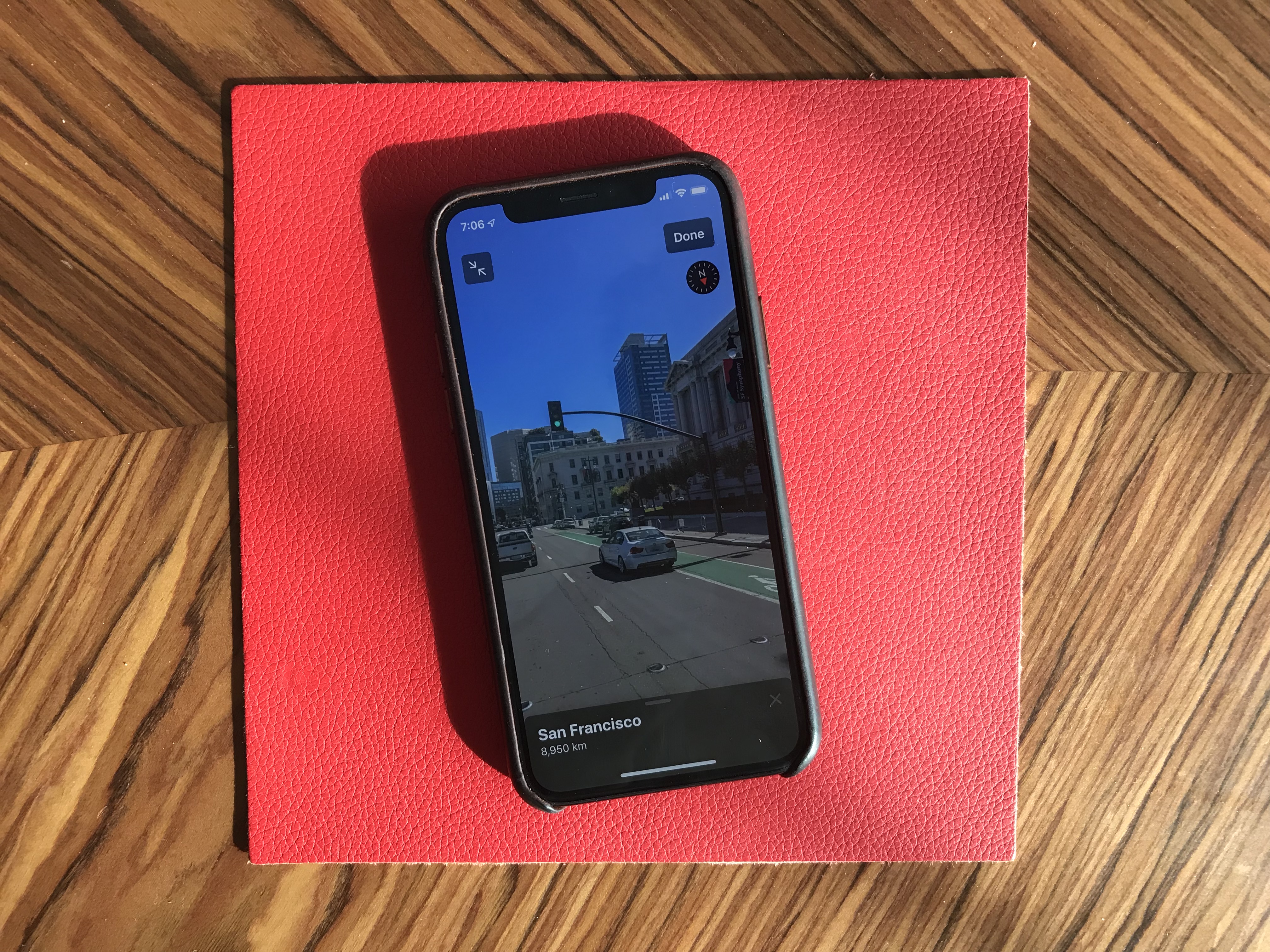
Talking about Google Maps, there’s a new Look Around feature that could have been called Apple Street View. I recommend trying the feature in San Francisco because it’s stunning. This isn’t just 360 photo shots — those are 3D representations of streets with foregrounds and backgrounds.
Messages is getting some much needed improvements. You can now choose a profile name and profile picture and share it with your contacts. I hate the default grey avatar, so it’s great to let people push a profile picture to other people.
If you have a Memoji-compatible device, you can now share Memoji stickers. If you’ve used Bitmoji in the past, this is Apple’s take on Bitmoji. And finally, search has been improved and is now actually useful. You can find an address or a specific message in no time.
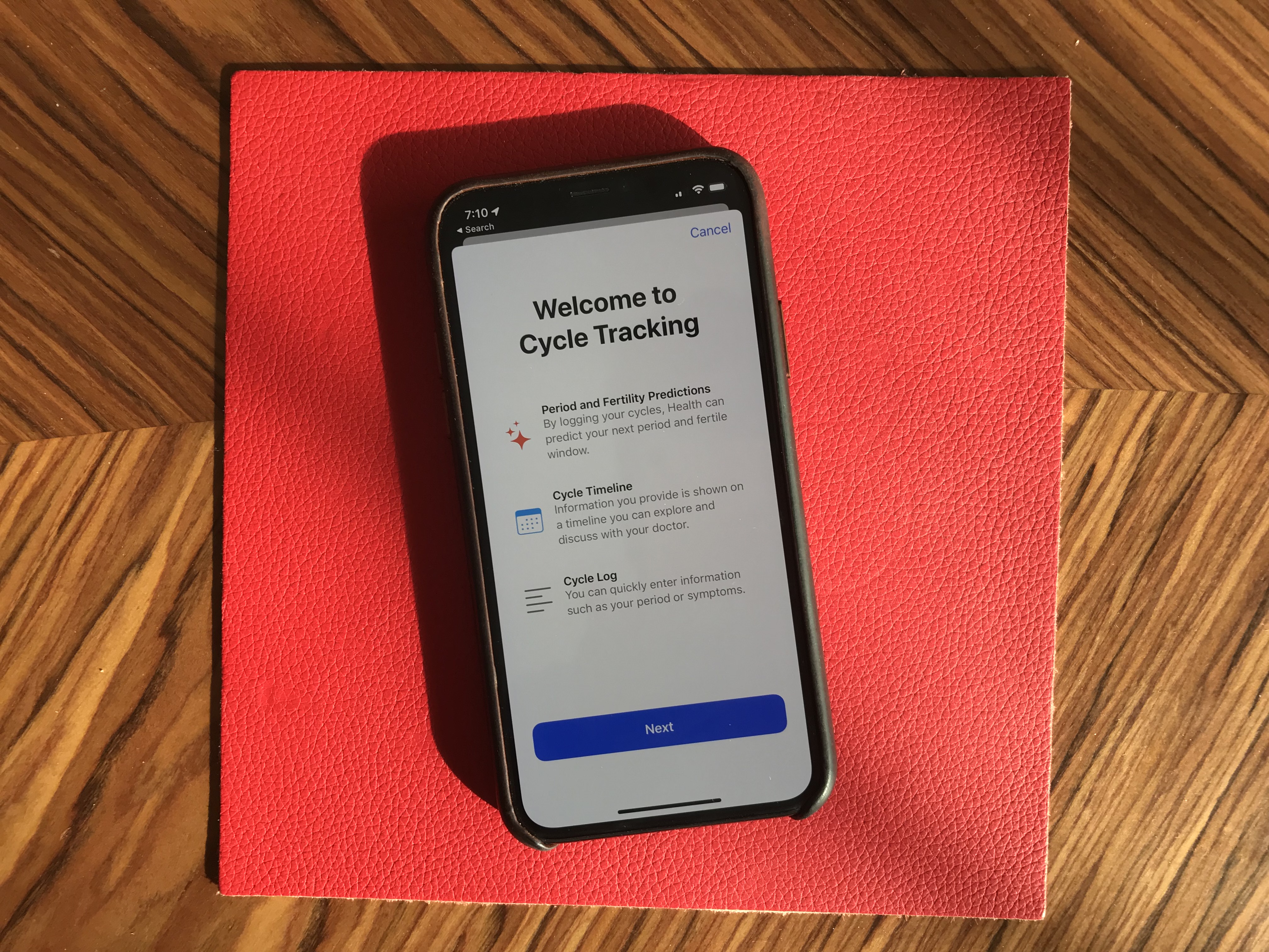
Health has been redesigned but features more or less the same data. But it’s worth noting that Apple now lets you track, visualize and predict your menstrual cycle from the Health app.
Privacy
iOS 13 has a big emphasis on privacy as well thanks to a new signup option called “Sign In with Apple”. I couldn’t try it as I couldn’t see the option in any app. But Sarah Perez already wrote a great explainer on the topic.
In a few words, this button will let you create an account for a service without inputing an email address and password, and without connecting with your Google or Facebook account. Apple keeps as little data as possible — it’s all about creating a unique identifier and storing that in your iCloud keychain.
Apple is adding more ways to control your personal information. If an app needs your location for something, you can now grant access to your location just once. The app will have to ask for your permission the next time. Similarly, iOS 13 can tell you when an app has been tracking your location in the background with a map of those data points.
But I didn’t realize iOS 13 also blocks Bluetooth scanning by default in all apps. Many apps scan for nearby Bluetooth accessories and compare that with a database of Bluetooth devices around the world. In other words, it’s a way to get your location even if you’re not sharing your location with this app.
You now get a standard permission popup for apps that actually need to scan for Bluetooth devices — Mobike uses Bluetooth to unlock bikes or Eve uses Bluetooth to interact with connected objects for instance. But the vast majority of apps have no reason to scan for Bluetooth devices. You can decline Bluetooth permission and use Bluetooth headphones normally.

Random tidbits
Let’s go through some tiny little updates:
- App updates are smaller because iOS doesn’t download everything from their servers — only files that are relevant to your current device.
- Files works with Samba file servers, and you can zip/unzip files.
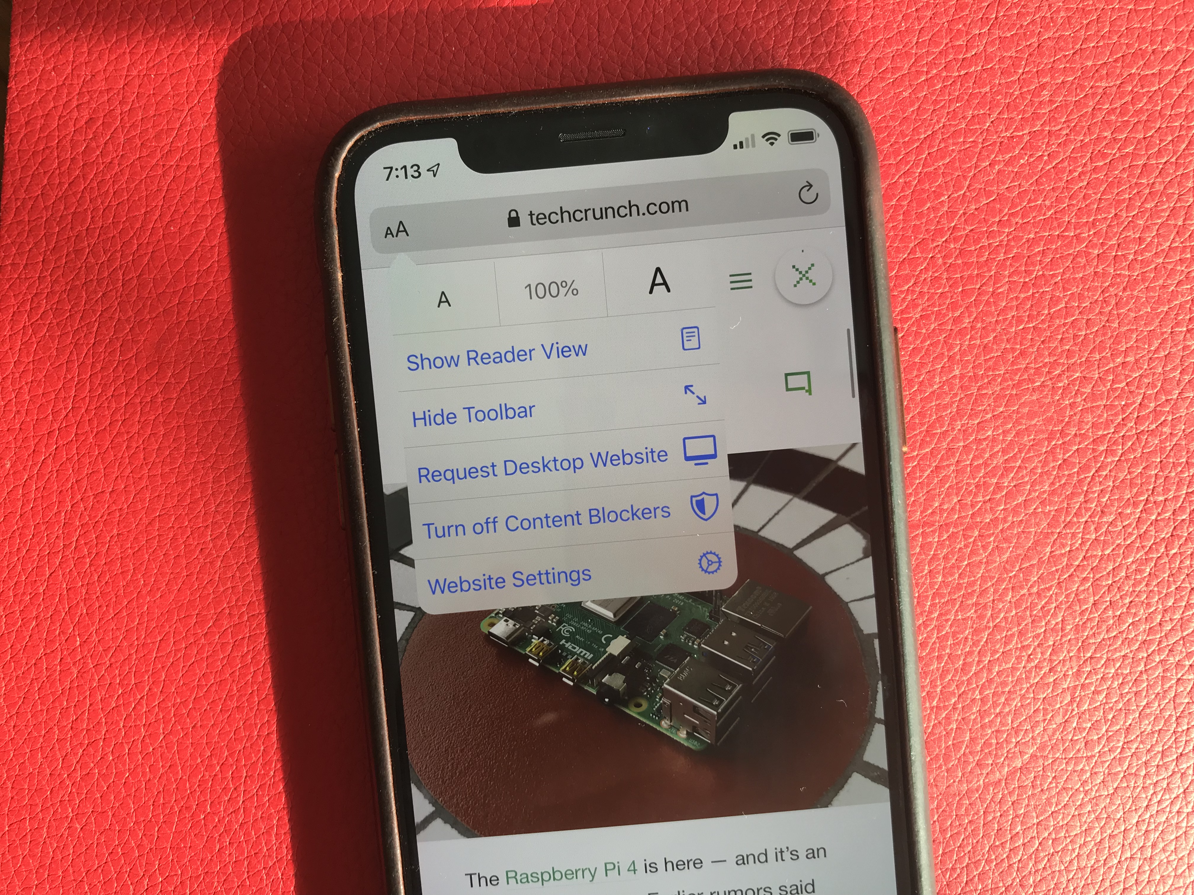
- Safari features a new site settings popup to request the desktop site, disable a content blocker or enable reader view. This is much cleaner than before.
- Notes has a new gallery view.
- Mail lets you customize font style, size and color. You can also indent text, create bulleted lists, etc.
- Find My iPhone and Find My Friends have been merged in a new Find My app. It also theoretically can help you find misplaced devices using other Apple devices from other people around your device — everything is supposed to be end-to-end encrypted.
Things I couldn’t try
- CarPlay has been redesigned for the first time in years. But I don’t own a car.
- You can store security camera footage in iCloud if your camera is HomeKit-compatible. But I don’t own a security camera.
- ARKit has been improved and can detect people in the real world.
- You can install custom fonts from the App Store and manage them from the settings. You can then use those fonts in any app.
- Lyrics in the Music app now scroll just like in a karaoke. I haven’t tried that.
- The Reminders app has been redesigned but I wasn’t using the app before. It feels like a full-fledged task manager now. Maybe I should use it.
Overall, iOS 13 feels like a breath of fresh air. Everything works slightly better than it used to. None of the changes are outrageous or particularly surprising. But they all contribute to making iOS a more enjoyable platform.
from RSSMix.com Mix ID 8176981 https://techcrunch.com/2019/06/24/ios-13-preview/
http://www.gadgetscompared.com
from Tumblr https://ikonografico.tumblr.com/post/185823509991
via http://www.gadgetscompared.com
No comments:
Post a Comment